别人的图,source GS
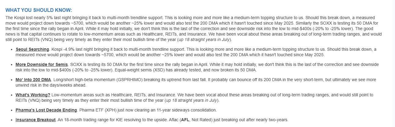
这是comments from Krinsky
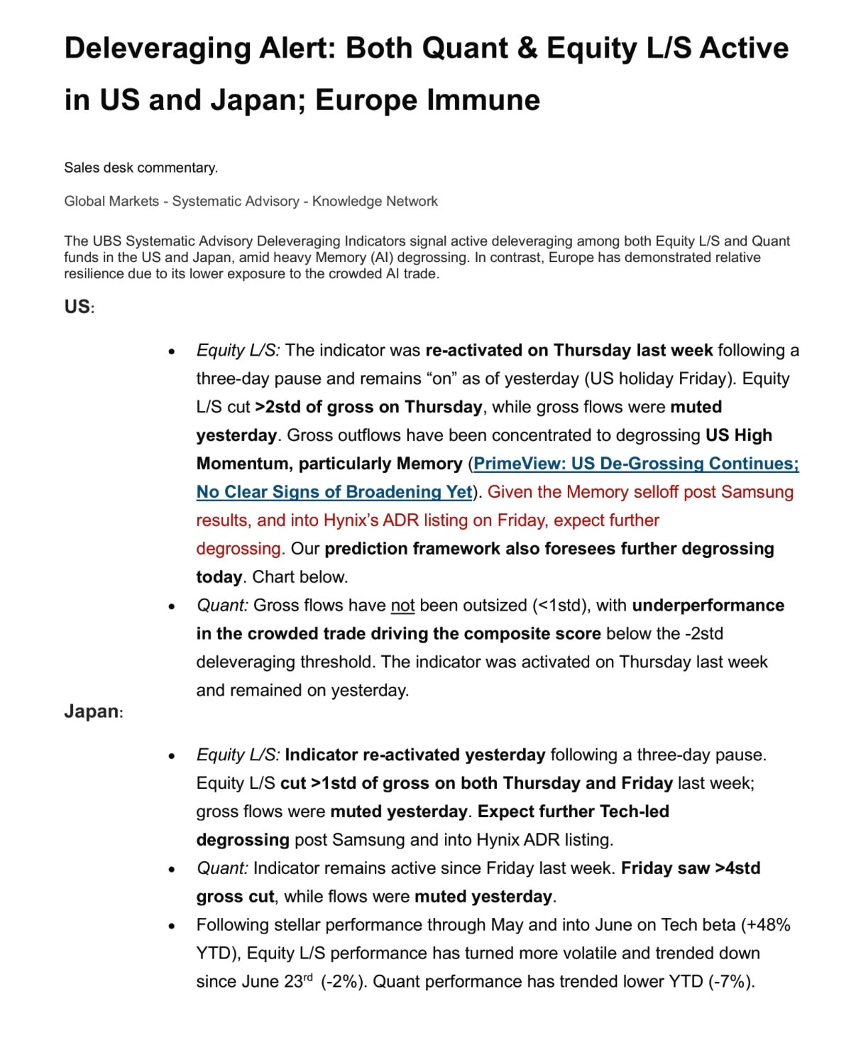
UBS
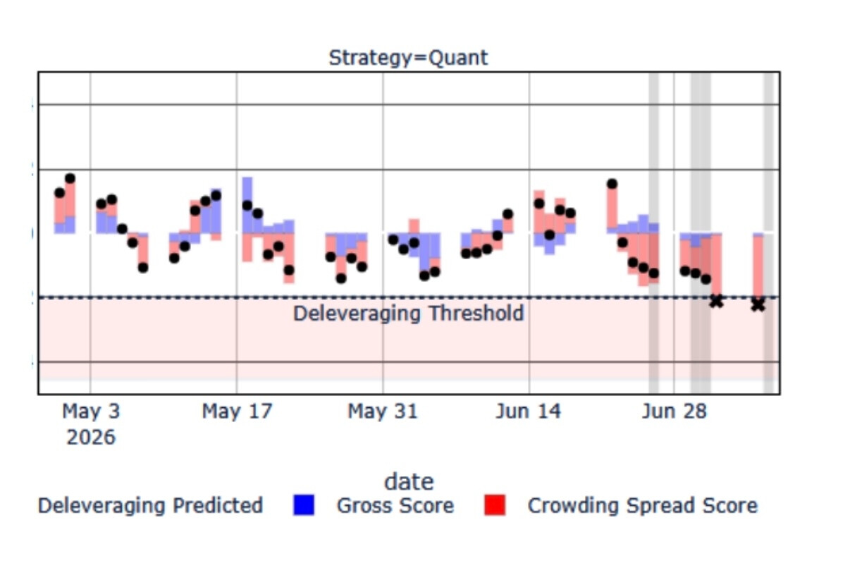
Key Components:Deleveraging Threshold - The horizontal dashed line represents a critical risk level. When market conditions approach or exceed this threshold, it signals that institutional investors (like hedge funds or prop trading desks) may be forced to reduce their leveraged positions to manage risk. This often creates selling pressure and market volatility.Black Dots (Deleveraging Predicted) - These data points indicate when the quantitative model predicts deleveraging events are likely to occur based on market conditions, volatility, and positioning data.Blue Bars (Gross Score) - This measures the total exposure or activity level in the strategy, regardless of direction. Higher blue bars suggest more aggressive positioning or increased market participation.Red/Pink Bars (Crowding Spread Score) - This metric identifies when too many market participants are positioned similarly in the same trades. High crowding scores indicate elevated risk, as crowded trades tend to unwind violently when market conditions change.**Market Context:**The chart shows several periods where the strategy approached or exceeded the deleveraging threshold, particularly in late June (marked with X’s). During these periods, you can see corresponding spikes in both gross exposure and crowding scores, suggesting the model successfully identified high-risk market conditions where forced selling might occur.This type of systematic approach helps traders anticipate and potentially profit from periods of market stress when leveraged positions are unwound rapidly.